And here I thought I was just being weirdly picky about this!
…Well, I mean, it’s still probably weirdly picky, but now I’m part of a tradition of being weirdly picky about it!
I love when these patterns are naturally occurring. Didn’t know they had a name. Cool.
Also, one should apparently fight them with nail and teeth
I didn’t know the English word for that. I like it, it’s kind of poetic.
Just Savage:
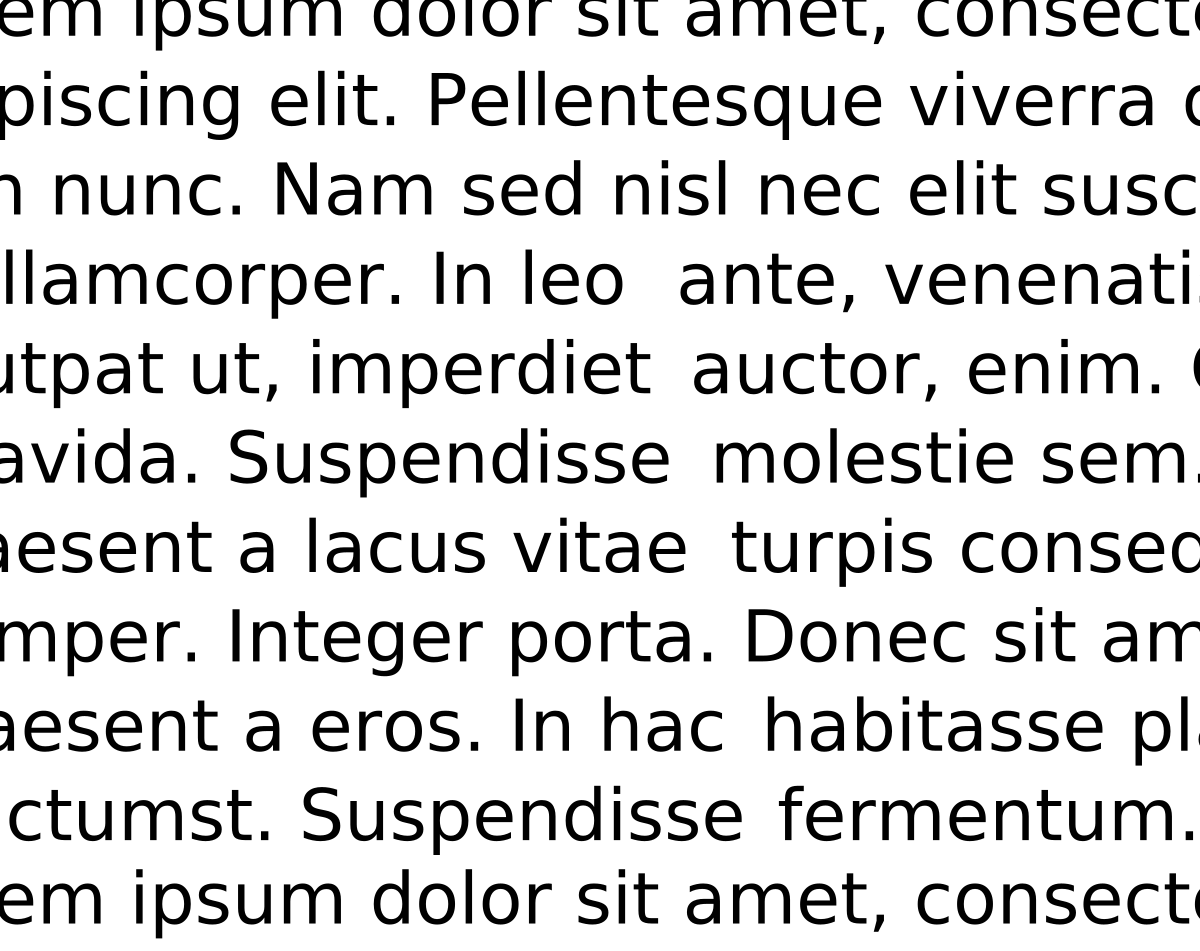
A carefully composed text page appears as an orderly series of strips of black separated by horizontal channels of white space. Conversely, in a slovenly setting the tendency is for the page to appear as a grey and muddled pattern of isolated spats, this effect being caused by the over-widely separated words. The normal, easy, left-to-right movement of the eye is slowed simply because of this separation; further, the short letters and serifs are unable to discharge an important function—that of keeping the eye on “the line”. The eye also tends to be confused by a feeling of vertical emphasis, that is, an up & down movement, induced by the relative isolation of the words & consequent insistence of the ascending and descending letters. This movement is further emphasized by those “rivers” of white which are the inseparable & ugly accompaniment of all carelessly set text matter.[7]
Me and my homies hate justified alignment
Nah, it looks cool up until you go to actually read the text
Also, this can happen with unjustified text
Neat, TIL
Does anyone else unironically love when this happens??
This explains so much.